
| GRAPHIC | Hong Kong
Form Society
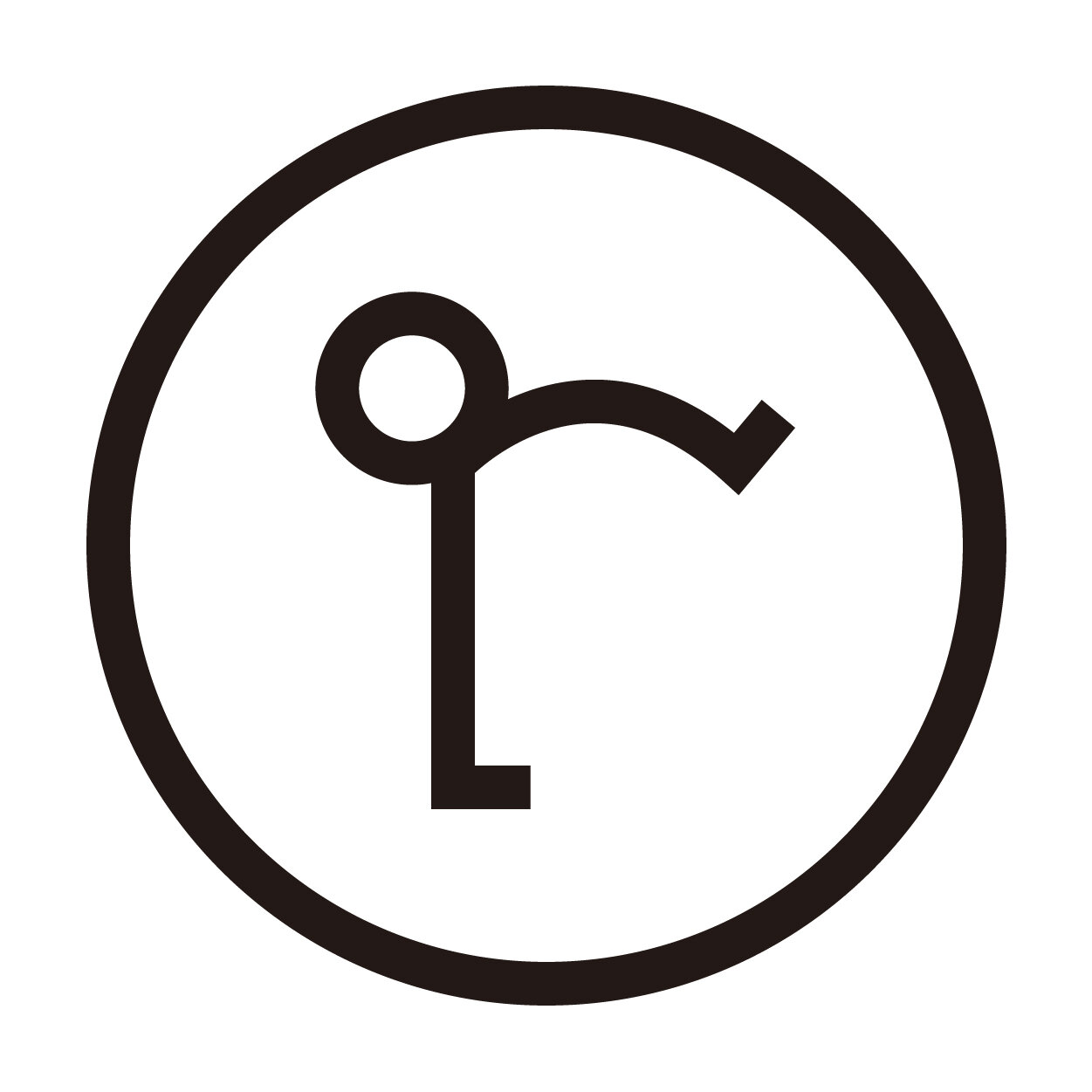
“Form Society 合舍” is a space for gathering, interaction and co-operation, with the principle of “community building”, we named it as “Form Society” since “Form” is a pun for “Formation” and “Shape”.

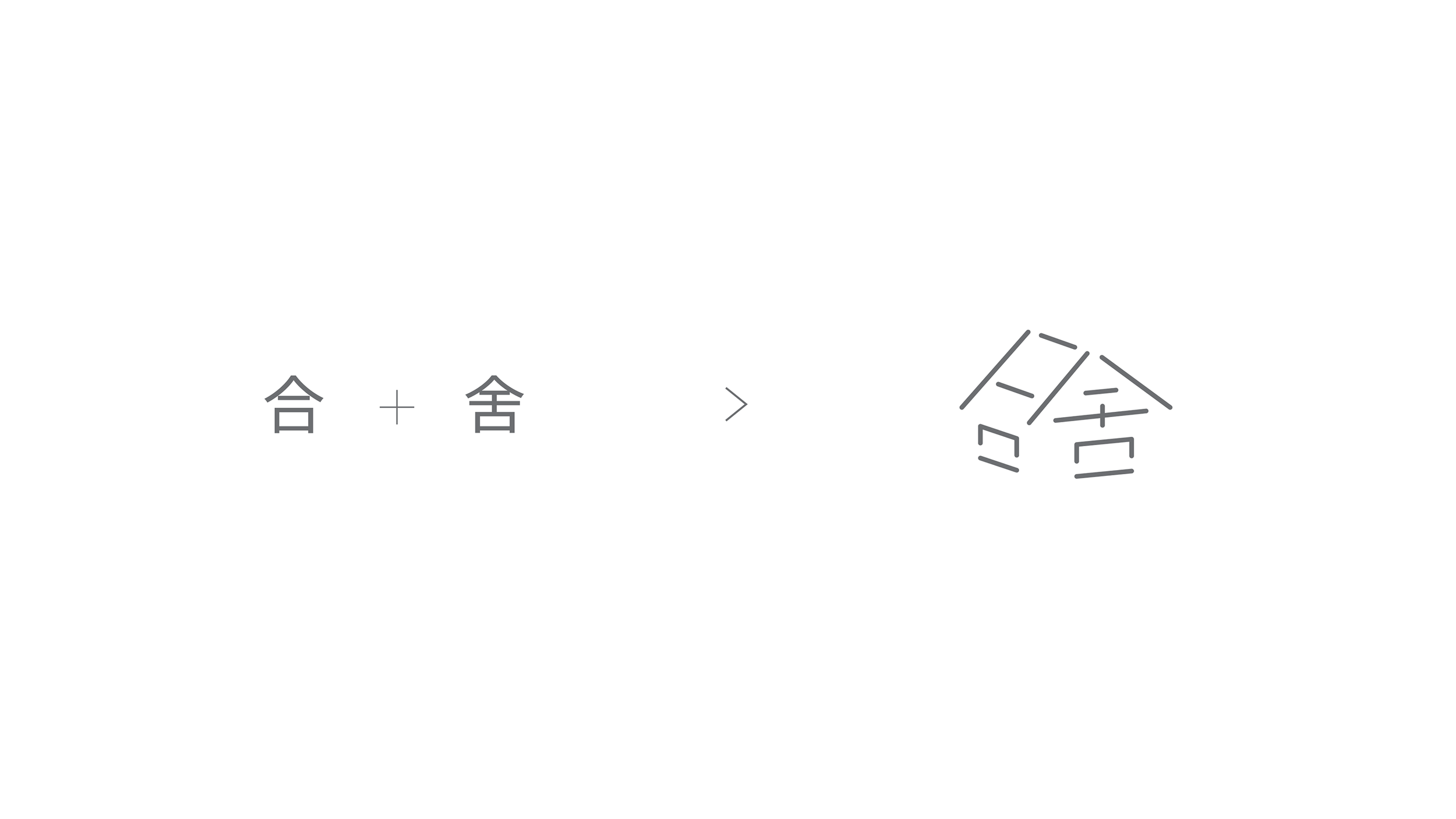


At first glance the logo is in a form of a little house, but in detail it is a combination of the two Chinese characters“合”and“舍”, which also represent the Chinese name of Form Society, and the joining characters symbolize connections, sharing and co-working. The hidden initial“F”for Form Society is placed on the top left corner on the logo.
The logo is structured and built by open lines, it is a metaphor for possibilities and imaginations, while the negative spaces are the invisible trust and support among the community, giving effort to create things for good together.
Finally, soft and rounded lines of the logo are representations for humanity and harmony in the society, as well as pointing out Form Society is a space for art and cultural activities, they formed a contrast with the Chinese logotype for better legibility.
Identity and Naming:
Saki Ho @ Research Studio (Tokyo)
Javin Mo @ Milkxhake (Hong Kong)
About Form Society